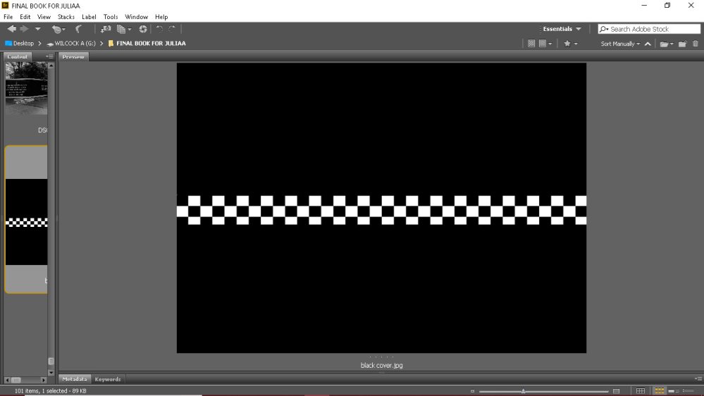
Now that I have the majority of substance for within my book I have been thinking about the cover. I want it to be simple yet recognisable. At first, I wondered if the chequered line would be too cliche. But through a few edits and testing it out as you can see in my sketches and initial designs I have decided on a darker cover.
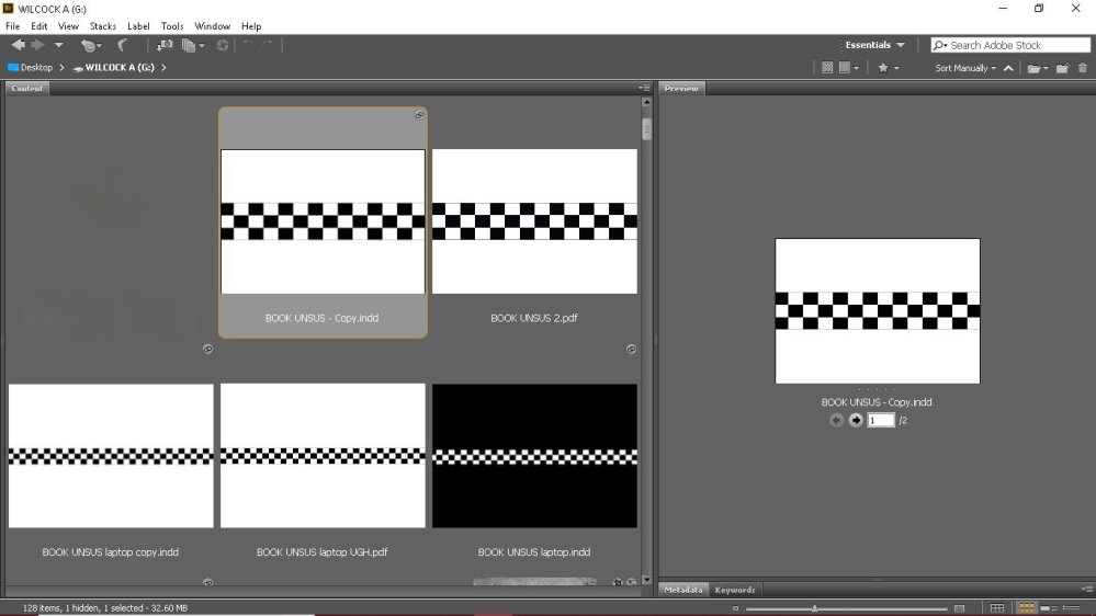
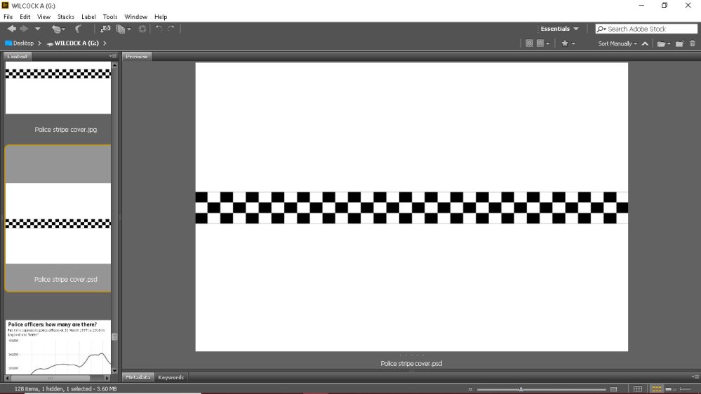
My initial cover was white with the check line. At first, the squares were too big and it looked clunky and not professional at all.
I then minimised the squares and made the line a bit thinner. Once printing it for my dummy book and seeing it work with the images inside I wasn’t convinced.
I want my final book to have a serious and almost sombre tone. The bright white and check gave me a finish line flag feeling. It wasn’t serious enough. Then when thinner I liked it but something wasn’t right still.
I have been struggling to imagine this book as an online production. I feel as though this book would work well as a physical copy. I see it as a matte black hard copy a4 landscape style. But saying that I need to take that out my head and think about how it will work on issuu.
I have also made the decision of………….. No title. A bold decision, maybe. The wrong decision also maybe. I will talk about this further in a following post but this has allowed me to work with the cover design more as I am not having to incorporate wording.
As it stands Imy cover will be black with the check line across it. I feel this is a simple sleek and holds the right tone I am looking for. I don’t see it changing but when creating a book parts do always change.